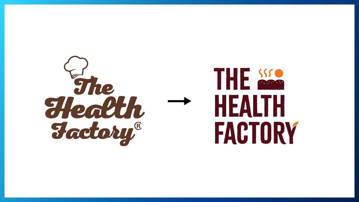
The Health Factory, the brand known for India’s first zero maida and protein bread, has unveiled a fresh new look with a new visual identity.
Anchored in the purpose of All for Health. Health for All, the new identity is designed to spark nationwide conversations around keeping health simple, accessible, and understanding what it truly means in everyday life, starting with our daily staples. The brand’s refreshed packaging design, built on a bold, structured grid system, mirrors its core values of transparency, functionality, and a consumer-first approach.
The rebrand aims to deepen this connection while setting the stage for the brand’s next phase of growth, innovation, and product launches. The rebranding rollout will encompass a new design language across all consumer touchpoints, including digital platforms, retail presence, and product packaging, ensuring a consistent and recognizable brand experience.


To further amplify the rebrand, a brand film will soon be unveiled, showcasing the refreshed identity and the brand’s mission to make health an everyday choice.
The Health Factory has experienced strong growth, with its products now available across 16 cities and through major e-commerce, q-commerce and retail channels, reaching millions of households across India.
The brand’s expanding footprint reflects the rising consumer demand for clean-label, high-protein staples, positioning The Health Factory at the forefront of India’s shift towards better everyday eating. Despite the dominance of legacy brands, The Health Factory has successfully penetrated the market and established a strong presence.
Vinay Maheshwari, CEO of The Health Factory, said, “We did not rebrand for a design update. We want people to remember and celebrate The Health Factory for what it truly stands for. We’re still the same at the core, making health your everyday staple. And still driven by the same purpose. This fresh new look is an evolution of our journey; and this bolder, clearer, sharper identity reflects that.”