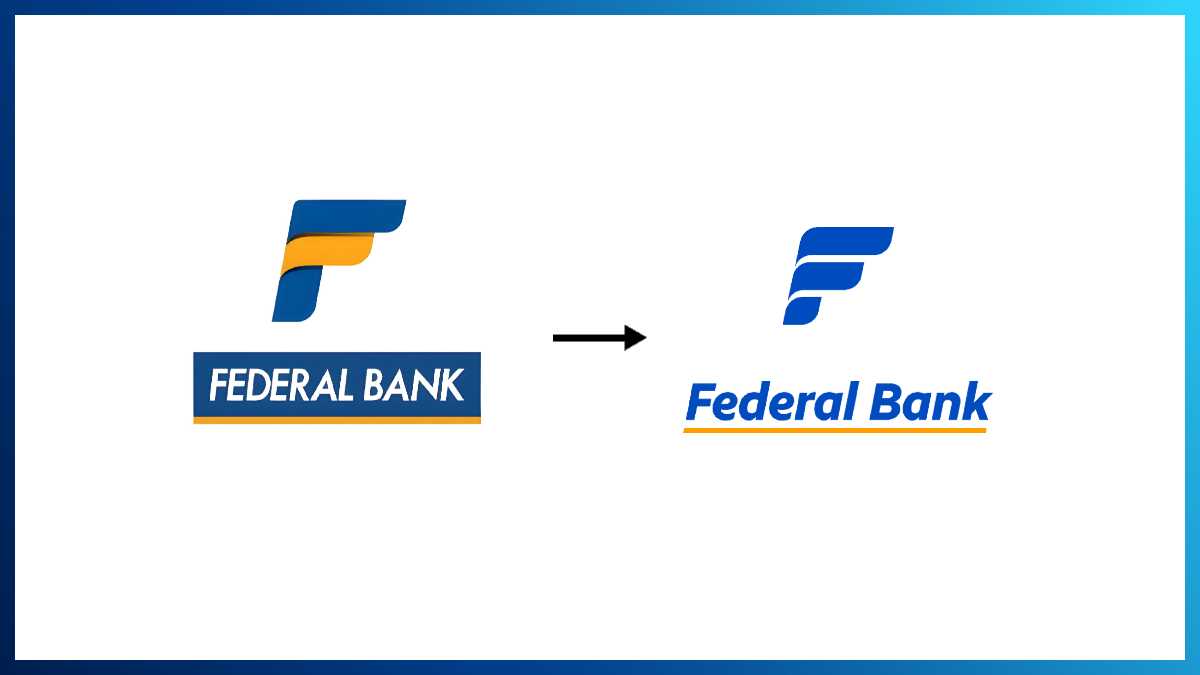
Federal Bank unveiled The Fortuna Wave, its refreshed brand identity that reflects the Bank’s evolution and desire to be contemporary and future-ready, respectively.
The Fortuna Wave represents Authenticity, Prosperity and Togetherness, the Bank seeks from its Customers, Investors and Employees. The intent behind the refresh was to enhance the recognition and differentiation of the Federal Bank Brand. This will ensure a distinct, coherent, and continuous visual language across their physical and digital assets.
The word mark – FEDERALBANK, now has a more fluid, forward and round edge approach. These symbolise being approachable, ready with solutions and welcoming everyone with high levels of service delivery. The upper case has given way to well-rounded typeface which balances sharpness with warmth- symbolising precision without authority. Retaining the italicised style preserves the Bank’s unique visual DNA, and the familiar yellow underline continues to stand for partnership and support- reinforcing the Bank’s role as a trusted platform for customers. The boxed structure has been freed, allowing the logo to adapt fluidly across mediums and digital touchpoints.

The Fortuna Wave is the brand’s insignia which is redefined and modernised as a central asset to all outreach and engagement efforts. The three waves represent authenticity, togetherness, and prosperity; the values that guide Federal Bank’s journey of progress. The emblem serves as a symbol of collective growth, optimism, and forward movement. Simplified for seamless digital expression, the insignia now becomes a living vessel for the brand’s storytelling.
The new logo and insignia enhance visibility, legibility, style, tone, colour usage and adaptability. The sentence-case format has given way to a balance between professionalism and friendliness. The Fortuna Wave will have multiple variations optimized for different backgrounds, contexts and moment marketing initiatives. This flexibility ensures consistent brand representation across digital and physical touchpoints. The primary colours are more distinct, vibrant, and youthful, ensuring that the brand stands out to establish a strong, standalone identity.
KVS Manian, MD & CEO, Federal Bank, said, “Our refreshed brand identity represents a gentle evolution rather than a change in direction. This renewed expression brings a more contemporary and dynamic presence. It signals our preparedness for the future, without losing sight of the principles that have always defined us. While the look and feel have been renewed, the heart of Federal Bank remains the same. The core values that have shaped us over decades—trust, authenticity, and a deep commitment to our customers—continue to guide us.”
M V S Murthy, Chief Marketing Officer, Federal Bank, said, “Being a legacy brand gives us a vantage point to bring the best of our past into the present and fuel our future progress. Across the time lapse, a Brand Refresh is a great opportunity to be contemporary as we enhance our product and service propositions. Visual connect, though has many an unspoken word, it is the first impression for a brand. Discerning generation of customers coming up seek for more intuitive expressions of communication. Our refreshed identity morph into the Fortuna Wave promise Authenticity, Prosperity and Togetherness. These are Brand Values we cherish and demonstrate our intent through our engagements and experiences curated out for the Brand.”
Vidya Balan, the Brand Ambassador of Federal Bank, said, “Federal Bank reflects an institution secure in its foundations, clear in its direction, and committed to building a strong, sustainable franchise for the future. In my profession, there is a constant need to refresh and reinvent oneself. You are as good as your last hit. I feel overjoyed when the Brand whom I represent take equal amount of conscious effort for strengthening relevance. Their effort comes at a time when discernment is sharp amongst audiences.”