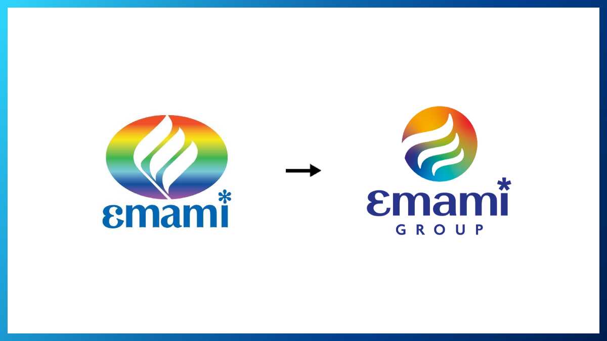
Emami has announced the launch of its new and refreshed corporate brand identity that reflects both its legacy and its evolving business direction.
The new corporate identity retains visual links to its previous design to show deep-rooted heritage and values. The iconic ellipse has transformed into a sphere, symbolizing the brand’s expanding global footprint, adaptability, and forward-looking mindset. At the core of the design, a stylized ‘e’ represents the innovation and reinvention that have driven the organization’s success over five decades, also signifying its continuous growth and dynamism.
The signature color palette has been maintained to ensure continuity and brand recognition across Emami’s diverse businesses, while embracing a modern and progressive aesthetic. A refined typeface in the new wordmark conveys confidence, boldness, and adaptability, mirroring Emami’s future vision.

This comprehensive rebranding extends to each of Emami’s diverse businesses, which will adopt a modern typeface and a distinctive color derived from the new sphere, allowing each entity to establish a uniquely styled name and visual identity. The full rollout of the new corporate identity across all Emami business entities is anticipated to be completed within the next couple of months.
Harsha Vardhan Agarwal, Vice Chairman and Managing Director, Emami, said, “Our rebranding marks a pivotal step in Emami’s evolution. Our new core corporate identity reflects who we are today — an organization rooted in heritage but powered by innovation, diversification and a global outlook. It is a symbol of the journey we have made, and the exciting path ahead. We believe this refreshed corporate identity will strengthen our market position and foster deeper connections with our consumers and partners, as we continue to deliver high-quality, value-driven, and innovative offerings across our businesses.”